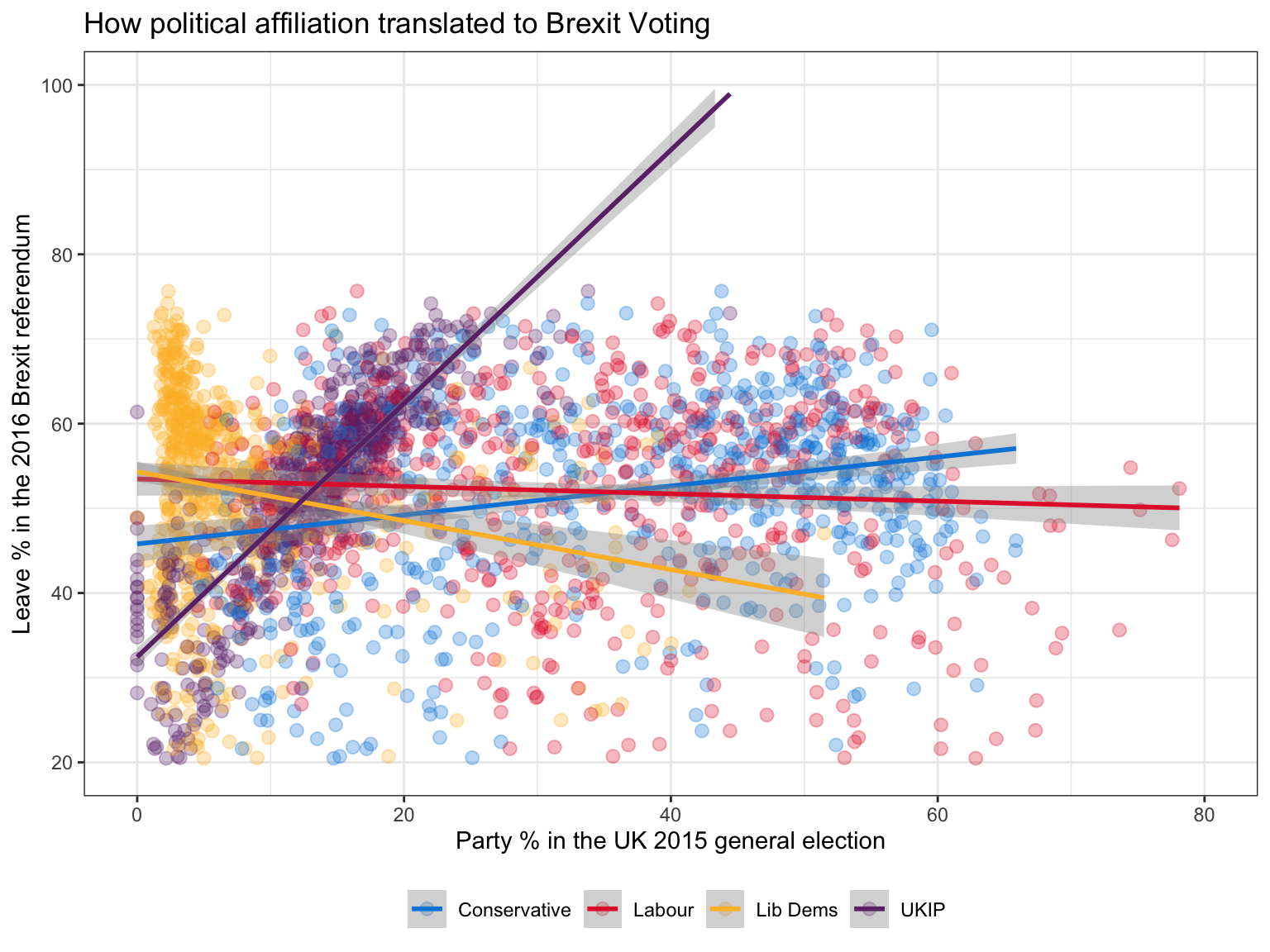
Analysis on Brexit voting result

Challenge 1: Brexit plot
Using your data manipulation and visualisation skills, please use the Brexit results dataframe (the same dataset you used in the pre-programme assignment) and produce the following plot. Use the correct colour for each party; google “UK Political Party Web Colours” and find the appropriate hex code for colour, not the default colours that R gives you.
brexit <- read_csv("https://raw.githubusercontent.com/kostis-christodoulou/am01/master/data/brexit_results.csv")brexit %>%
# Pivot the data into longer format so that parties are in the same column
pivot_longer(col = 2:5,
names_to = "party",
values_to = "percent") %>%
ggplot(aes(x = percent, y = leave_share,color = party))+
# Set the transparency of the points to be 0.5
geom_point(size = 2.5,alpha = 0.3)+
# Draw a fitted line with standard error
geom_smooth(method = "lm", se = TRUE)+
# Assign color for each party
scale_color_manual(labels = c("Conservative", "Labour","Lib Dems","UKIP"),
values = c("#0087DC", "#E32636","#FDBB30","#6D3177")) +
theme_bw()+
theme(legend.position = "bottom",legend.title = element_blank())+
scale_y_continuous(breaks=seq(20, 100, 20),
limits = c(20,100))+
scale_x_continuous(breaks=seq(0, 80, 20),
limits = c(0,80))+
labs(title="How political affiliation translated to Brexit Voting",
x="Party % in the UK 2015 general election",
y = "Leave % in the 2016 Brexit referendum")