Rent in San Francisco

Rents in San Francsisco 2000-2018
# download directly off tidytuesdaygithub repo

rent <- readr::read_csv('https://raw.githubusercontent.com/rfordatascience/tidytuesday/master/data/2022/2022-07-05/rent.csv')
What are the variable types? Do they all correspond to what they really are? Which variables have most missing values?
The data is separated into both characters and numbers. At first look, the data types seem to be correctly allocated given the nature of the variables. As for completeness, the most missing value is the description with 197,542 missing. However, details and location (address and coordinates) are closely behind. This is not very surprising, as people are both careful with publishing addresses on craigslist and lazy in writing detailed descriptions.
# Inspect the rent data
skimr::skim(rent)| Name | rent |
| Number of rows | 200796 |
| Number of columns | 17 |
| _______________________ | |
| Column type frequency: | |
| character | 8 |
| numeric | 9 |
| ________________________ | |
| Group variables | None |
Variable type: character
| skim_variable | n_missing | complete_rate | min | max | empty | n_unique | whitespace |
|---|---|---|---|---|---|---|---|
| post_id | 0 | 1.00 | 9 | 14 | 0 | 200796 | 0 |
| nhood | 0 | 1.00 | 4 | 43 | 0 | 167 | 0 |
| city | 0 | 1.00 | 5 | 19 | 0 | 104 | 0 |
| county | 1394 | 0.99 | 4 | 13 | 0 | 10 | 0 |
| address | 196888 | 0.02 | 1 | 38 | 0 | 2869 | 0 |
| title | 2517 | 0.99 | 2 | 298 | 0 | 184961 | 0 |
| descr | 197542 | 0.02 | 13 | 16975 | 0 | 3025 | 0 |
| details | 192780 | 0.04 | 4 | 595 | 0 | 7667 | 0 |
Variable type: numeric
| skim_variable | n_missing | complete_rate | mean | sd | p0 | p25 | p50 | p75 | p100 | hist |
|---|---|---|---|---|---|---|---|---|---|---|
| date | 0 | 1.00 | 2.01e+07 | 44694.07 | 2.00e+07 | 2.01e+07 | 2.01e+07 | 2.01e+07 | 2.02e+07 | ▁▇▁▆▃ |
| year | 0 | 1.00 | 2.01e+03 | 4.48 | 2.00e+03 | 2.00e+03 | 2.01e+03 | 2.01e+03 | 2.02e+03 | ▁▇▁▆▃ |
| price | 0 | 1.00 | 2.14e+03 | 1427.75 | 2.20e+02 | 1.30e+03 | 1.80e+03 | 2.50e+03 | 4.00e+04 | ▇▁▁▁▁ |
| beds | 6608 | 0.97 | 1.89e+00 | 1.08 | 0.00e+00 | 1.00e+00 | 2.00e+00 | 3.00e+00 | 1.20e+01 | ▇▂▁▁▁ |
| baths | 158121 | 0.21 | 1.68e+00 | 0.69 | 1.00e+00 | 1.00e+00 | 2.00e+00 | 2.00e+00 | 8.00e+00 | ▇▁▁▁▁ |
| sqft | 136117 | 0.32 | 1.20e+03 | 5000.22 | 8.00e+01 | 7.50e+02 | 1.00e+03 | 1.36e+03 | 9.00e+05 | ▇▁▁▁▁ |
| room_in_apt | 0 | 1.00 | 0.00e+00 | 0.04 | 0.00e+00 | 0.00e+00 | 0.00e+00 | 0.00e+00 | 1.00e+00 | ▇▁▁▁▁ |
| lat | 193145 | 0.04 | 3.77e+01 | 0.35 | 3.36e+01 | 3.74e+01 | 3.78e+01 | 3.78e+01 | 4.04e+01 | ▁▁▅▇▁ |
| lon | 196484 | 0.02 | -1.22e+02 | 0.78 | -1.23e+02 | -1.22e+02 | -1.22e+02 | -1.22e+02 | -7.42e+01 | ▇▁▁▁▁ |
Make a plot that shows the top 20 cities in terms of % of classifieds between 2000-2018. You need to calculate the number of listings by city, and then convert that number to a %.
The final graph should look like this
# Group by city and count
rent %>%
  group_by(city) %>%
  count() %>%
  # count the rows with in a group and returns a new column n
  ungroup %>%
  mutate(pct_city = n/sum(n)) %>%
  # divided each group's number of rentals by the total amount(sum of all groups)
  slice_max(order_by=pct_city, n=20) %>%
  ggplot(aes(x=pct_city,y=fct_reorder(city,pct_city))) +
    geom_col()+
    labs(title="San Francisco accounts for more than a quarter of all rental classifieds",subtitle ="% of Craigslist listings, 2000-2018",x=NULL,y=NULL,caption = "Source: Pennington, Kate (2018). Bay Area Craigslist Rental Housing Posts,2010-2018")+
    theme_bw()+
    theme(panel.border = element_blank()) +
    scale_x_continuous(labels = scales::percent) #Transform the x-axis label into percentage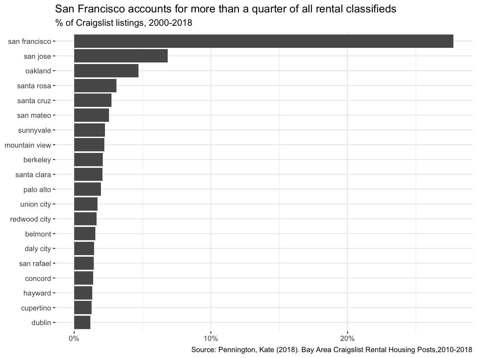
Make a plot that shows the evolution of median prices in San Francisco for 0, 1, 2, and 3 bedrooms listings. The final graph should look like this

rent %>%
  filter(city=="san francisco", beds==0:3) %>%
  group_by(beds,year) %>%
  summarize(median_price=median(price)) %>%
  ggplot(aes(x=year,y=median_price,colour=factor(beds)))+
  geom_line()+
  labs(title="San Francisco rents have been steadily increasing",subtitle = "0 to 3-bed listings,  2000-2018",x=NULL,y=NULL,caption = "Source: Pennington, Kate (2018). Bay Area Craigslist Rental Housing Posts,2010-2018")+
  facet_wrap(~beds,nrow=1)+ #facet beds
  theme_bw()+ # change the theme as black-white
  theme(legend.position = "none")+ # hide the legends
  scale_color_manual(values = c("red","green","blue","purple"))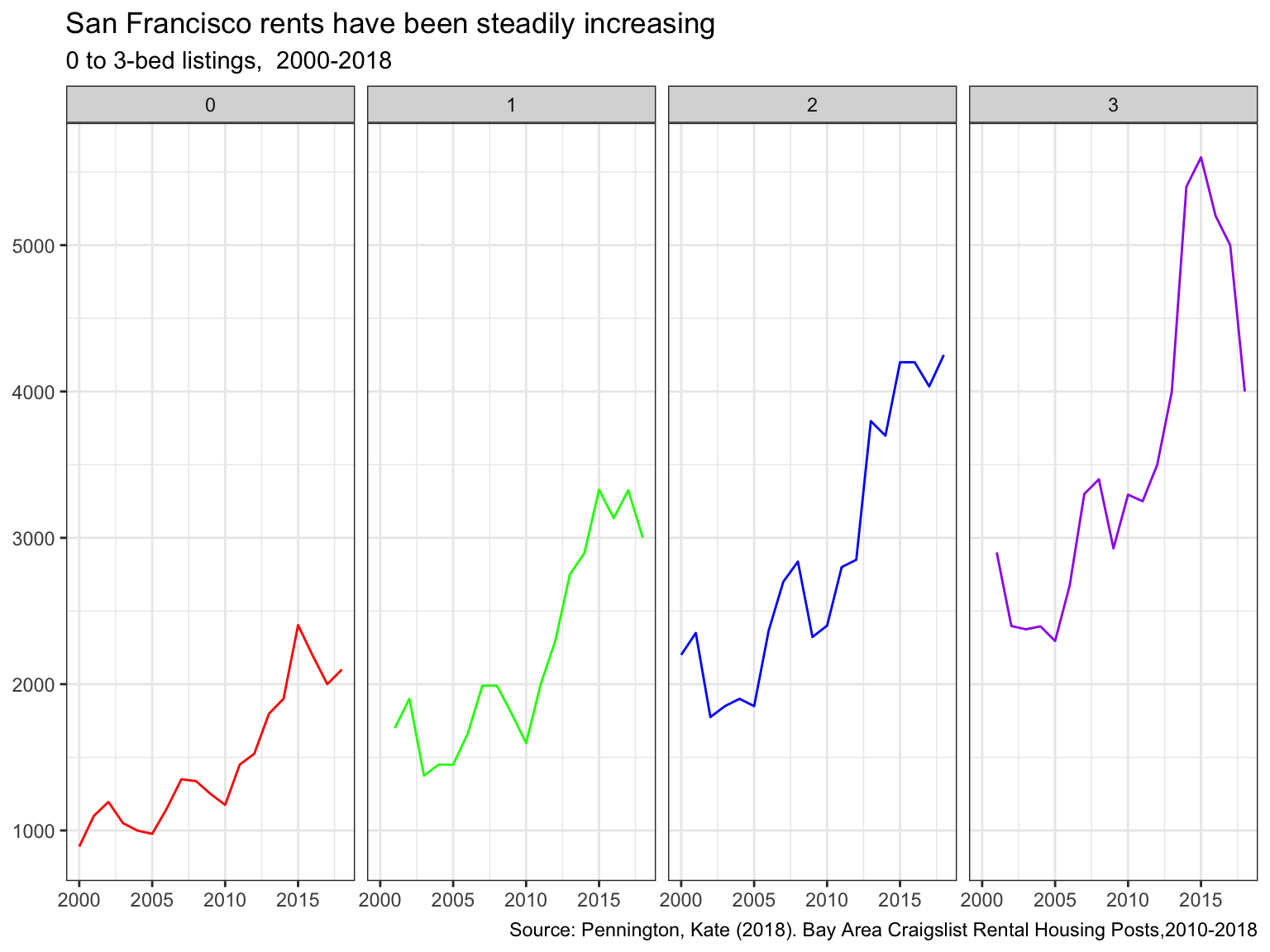
Finally, make a plot that shows median rental prices for the top 12 cities in the Bay area. Your final graph should look like this

# find the top 12 cities
top_cities = rent %>%
  group_by(city) %>%
  count() %>%
  ungroup %>%
  mutate(percent = n/sum(n)) %>%
  slice_max(order_by=percent, n=12)

rent %>%
  filter(beds==1,
         city %in%  top_cities$city) %>% #filter out the cities with 1 bed
  group_by(city,year) %>%
  summarize(median_price=median(price)) %>%
  ggplot(aes(x=year,y=median_price,colour=city))+
  geom_line()+
  facet_wrap(~city,nrow=3)+
  theme_bw()+
  labs(title="Rental prices for 1-bedroom flats in the Bay Area",x=NULL,y=NULL,caption = "Source: Pennington, Kate (2018). Bay Area Craigslist Rental Housing Posts, 2010-2018")+
  theme(legend.position = "none")# hide the legend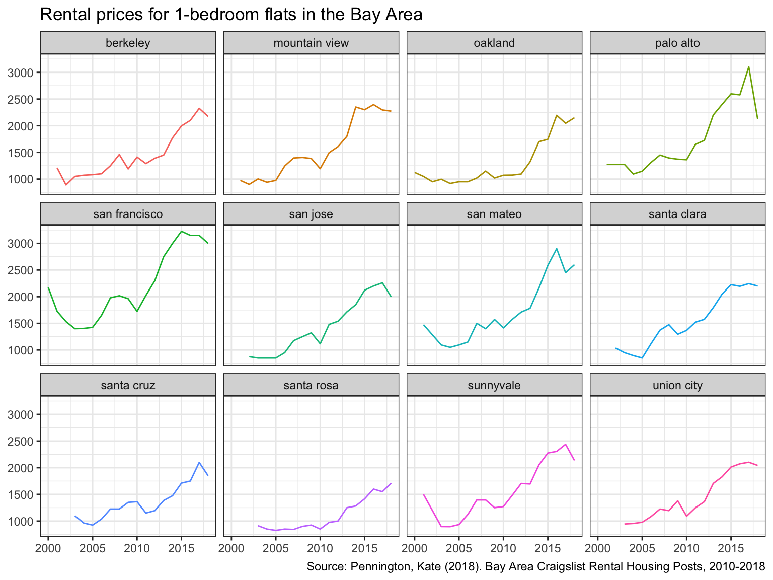
What can you infer from these plots? Don’t just explain what’s in the graph, but speculate or tell a short story (1-2 paragraphs max).
TYPE YOUR ANSWER AFTER (AND OUTSIDE!) THIS BLOCKQUOTE.
First of all, San Francisco has the most listings among all the cities it the Bay Area. The reason behind this could be that San Francisco has a booming economy and is a popular location for large companies, such as Uber or Twitter. These companies recruit a lot outside of San Francisco, leading to a large influx in individuals requiring local accommodation. As the demand is high, supply follows suit. Smaller towns like Redwood City have low population and don’t draw nearly as many foreign settlers. Therefore, the number of listings is comparatively lower.
The increase in rental prices between 2000 and 2018 in San Francisco is proportionally approximately the same between 0 to 3 bed listings. If there was a larger increase in families over that time frame, we could potentially see prices for 2 and 3 bedroom flats ascending more extremely given the increase demand. However, the demand seems to be equally balanced between all sizes. We should also not be surprised to see generally higher prices in San Francisco compared to other cities in the Bay Area. This is most likely a result of the popularity of the city for foreigners and the limited space available for additional housing, among others. By observing the price line charts for all cities in the Bay Area, we can see that all have experienced a rise in prices between 2000 and 2018. A natural increase over time is to be expected, given inflation. However we see more pronounced increases in some areas versus others, the reasons for which could be further investigated. An example would be Palo Alto, which is of course known for the Stanford Campus. Last but not least, the dip in 2008/2009 is worth mentioning. This is most likely a result of the financial crisis during that time. The difference in the gravity of the dip between cities provides some intriguing insights.